自定义字体项目 - Tokotype
XLSMART

Project Information

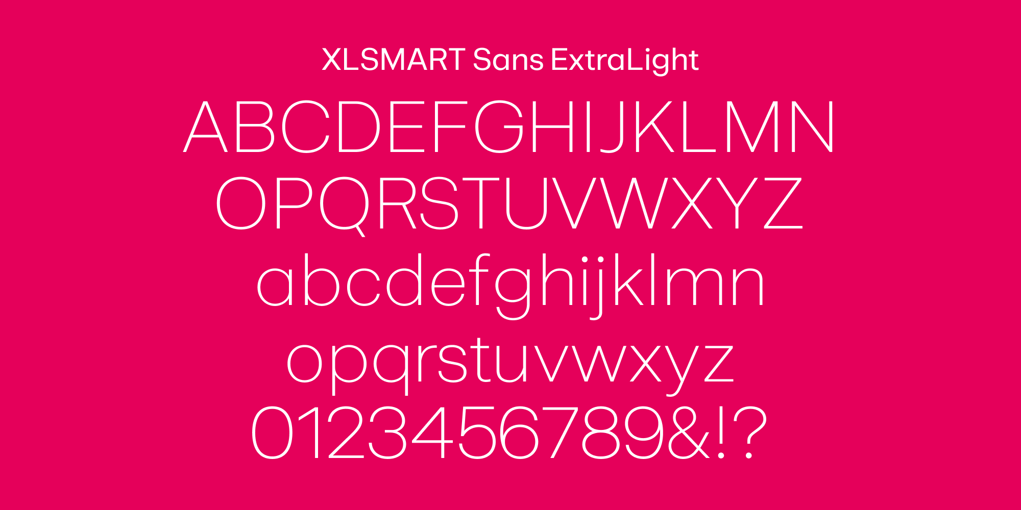
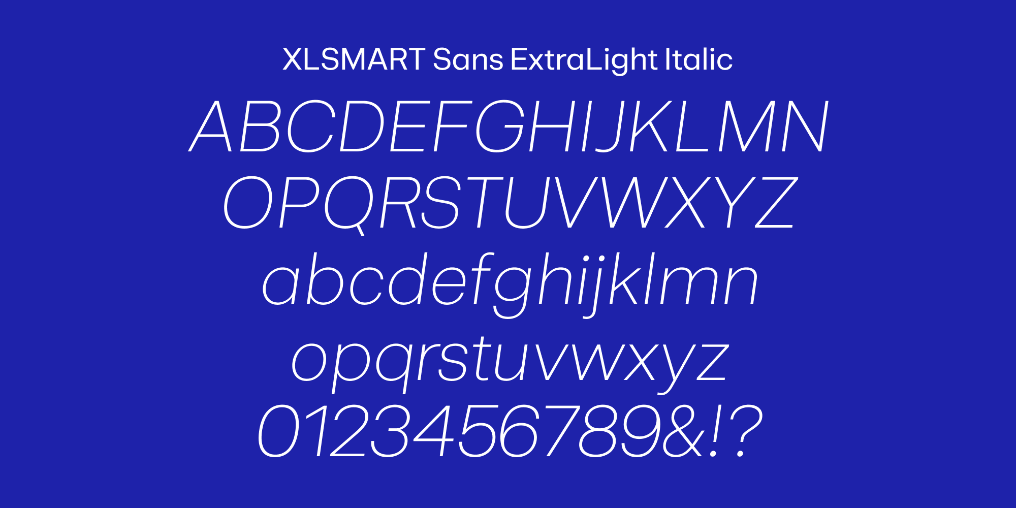
XLSMART Sans is a modern geometric sans serif designed to reflect the brand’s precision and empathy in equal measure. Built for clarity across data-driven environments, it balances functional simplicity with subtle warmth through open counters, rounded details, and compact forms.

Additional Information

Project

XLSMART

Agency

Edelman Indonesia, The Council Asia, Visious Studio

Styles

1 Family – 14 Styles

Scope of Work

Custom Typeface


Background


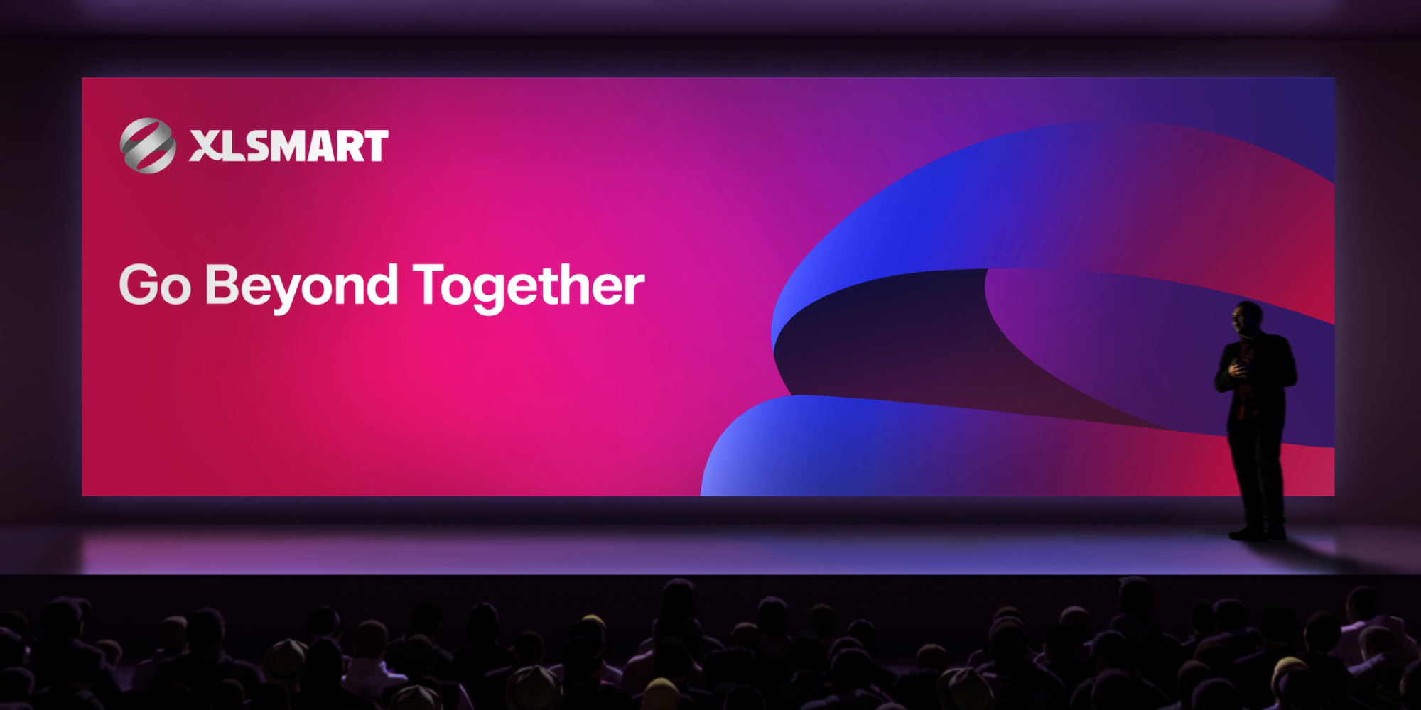
The landscape of Indonesian telecommunications underwent a historic shift with the merger of two industry leading: XL Axiata and Smartfren. This was not merely a technical consolidation of networks; it was the birth of XLSMART, a brand designed to be a movement of synergy and empowerment.


To anchor this new identity, XLSMART required a bespoke typographic system that could transition the brand from a traditional service provider to a human-centric leader in Indonesia’s digital era. The typeface needed to embody the brand’s core philosophy: Innovation with Heart.


Brief


The primary challenge was to define a typographic voice for a telco brand that leads through empathy and collaboration. The brief called for a modern geometric sans serif that could reflect precision and empathy in equal measure. This typeface had to be built for absolute clarity across data-driven environments, balancing functional simplicity with a sense of subtle warmth. Strategically, the goal was to shift the narrative away from signal strength or speed toward a more human-centered vision of inclusion and progress. The resulting font needed to be versatile enough to empower a nation while remaining rooted in the technical excellence required for a modern digital infrastructure.


Delivery


Tokotype delivered XLSMART Sans, a modern geometric typeface family that serves as the visual cornerstone of the brand’s digital and physical presence. The design achieves a unique balance by utilizing open counters and rounded details to soften its geometric foundation, ensuring the brand feels accessible and collaborative. Its compact forms are optimized for high-density environments, providing maximum legibility across various platforms. This comprehensive collection offers extensive functionality and expressive power, allowing XLSMART to communicate with both authority and approachability as it leads Indonesia into a new era of digital innovation.

相关项目

Traveloka 1

Traveloka

背景:作为品牌焕新计划的一部分,Traveloka 旨在融合视觉识别中的包容性和独特性,同时兼具抱负与亲和力,并展现出活力与信任。为了支持这一愿景,我们推出了 Godwit 字体家族,这是一款定制的几何无衬线字体,旨在体现这些价值观,并应用于所有传播平台。概要:我们的目标是设计一款多功能字体家族,以满足 Traveloka 品牌从醒目的标题到详尽的正文等各种需求,同时保持一致性和可识别性。Godwit 需要在现代感和温暖感之间取得微妙的平衡,在不牺牲功能性和清晰度的前提下,提供独特的视觉表达。该设计需要涵盖多个子系列,确保拉丁字母和泰文书写的一致性,并适用于从数字屏幕到户外广告等各种应用场景。成果:Godwit 字体家族是一个系统化、精致的字体家族,围绕其关键的独特特征构建而成。 Godwit字体某些字母夸张的上下比例,以及“W”和“M”等字母独特的镂空笔画,赋予其鲜明而充满活力的个性,同时又不影响阅读体验。这些巧妙的细节贯穿整个字体家族,确保了每个接触点视觉风格的一致性。该字体家族分为三个子类别:Godwit Display、Godwit Text和Godwit Thai。Godwit Display保留了该字体家族的独特风格,并针对户外广告、演示文稿和标题等大尺寸应用进行了优化。Godwit Text沿用了相同的视觉基因,但针对小尺寸阅读进行了微调,使其适用于正文、编辑内容和用户界面。为了拓展 Traveloka 的语言能力,Godwit Thai 字体直接参考了 Text 子系列的设计,实现了与泰文环境的无缝衔接,并巩固了 Traveloka 在东南亚的品牌影响力。最终呈现出的动态双语字体系统,完美契合了 Traveloka 焕然一新的品牌形象,使品牌在所有沟通渠道中都显得更加统一、易于理解且充满自信的现代感。

Gopay 2

Gopay

BackgroundAs one of Indonesia’s most widely used digital payment services, Gopay sought to evolve its visual identity to match its expanding role in everyday life. To achieve a deeper level of brand coherence and flexibility, Gopay introduced Rupa Sans and Rupa Serif, a pair of custom typefaces designed to bring a richer typographic voice to the brand’s communication. These typefaces were created to strengthen Gopay’s presence across digital, print, and environmental platforms, while staying true to the brand’s approachable and contemporary spirit.BriefThe task was to create a type system that offered both versatility and character. Gopay needed a sans-serif and a serif that could work individually or together, providing visual harmony across a broad range of applications. The design had to reflect a modern aesthetic while maintaining a human touch, connecting the brand to its audience with authenticity and warmth. The inspiration drew heavily from the twists and subtleties found in vernacular typographic traditions, aiming to create fonts that felt fresh and forward-looking without losing a sense of cultural continuity.DeliveryRupa Sans and Rupa Serif were developed as a sophisticated dual-font family, offering a complete typographic toolkit for Gopay’s growing ecosystem. Rupa Sans embodies a clean, modern structure with subtle details that reference traditional letterforms, ensuring it remains accessible and friendly. Rupa Serif, while more expressive, is crafted with the same underlying principles, blending classic serif influences with contemporary proportions to create a seamless pairing.The result is a system that allows Gopay to move fluidly between different tones of voice—from casual and direct to elegant and formal—without breaking visual consistency. The relationship between the two typefaces captures a unique balance: modern forms layered with nuanced echoes of the past. Across the Gopay design system, Rupa Sans and Rupa Serif work together to reinforce the brand’s identity as dynamic, trustworthy, and culturally grounded, ready to serve users at every level of interaction.

您有定制字体方面的项目想法吗?

请告诉我们您的项目情况。我们将在24小时内回复。

原文
请对此翻译评分
您的反馈将用于改进谷歌翻译