Ten years. That's how long it takes to master something, they say. For Tokotype, it's been a decade of typographic exploration, solving visual challenges one letterform at a time. The result? A collection book that serves as both archive and inspiration, printed with intention on a Risograph Machine EZ331A. This isn't your typical type catalog. It's a visual narrative that reveals what happens when design meets purpose.

The collection book printed with Risograph, featuring Makro Condensed typeface.
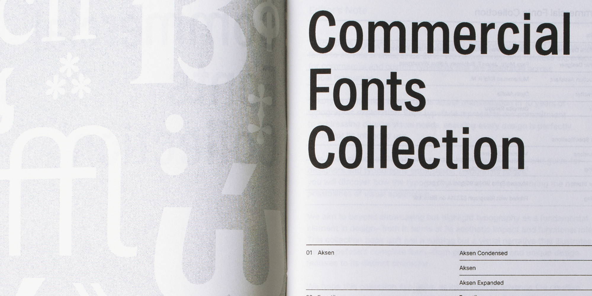
More Than Specimens on a Page
Open most font catalogs and you'll find neat rows of alphabets, maybe a few application samples. The Tokotype Collection Book takes a different approach.
This collection presents complete specimens of Tokotype's commercial font library, each carefully documented to show not just what the typeface looks like, but how it performs in real design contexts. Every spread reveals the relationship between form and function.

Leksikal Serif shown in multiple weights with real-world applications like signage and editorial text.
Take Leksikal Serif, for instance. The specimen pages don't just display the alphabet. They demonstrate how this typeface handles the demanding requirements of both display headlines ("Real-Time 12Counter Aisle K-24") and extended body text at smaller sizes. You see how the letterforms maintain clarity whether set at 72pt for environmental graphics or 12pt for product descriptions.
Each typeface tells a story. You'll see how letterforms were crafted to address specific visual needs. You'll discover the thinking behind every curve, every weight, every character that makes a font more than just decoration.
The book walks you through complete typeface systems: precise glyphs that solve readability challenges, unique design features that give brands their voice, and the distinct characteristics that make each font irreplaceable for its intended use.

Detailed specimen pages showing Leksikal Serif's complete character set, styles, and text samples applications.
The specimen format follows a consistent structure that serves designers' practical needs. Each font family includes:
- Complete style listings showing every weight and variation from Light to ExtraBold, including italics.
- Character set displays with uppercase, lowercase, numerals, punctuation, and special characters.
- Contextual demonstrations showing the typeface in realistic applications like product labels, technical specifications, and narrative text.
This systematic approach helps you quickly assess whether a typeface fits your project requirements. Need a font with true italics? Check the character set page. Wondering if it works for your food and beverages brands? See it applied to in-use pages.
Design That Respects the Craft
The physical book itself reflects typographic care, but more than that, it embodies the patience and precision that define quality printing.
Risograph printing isn't a push-button process. The EZ331A machine requires attention at every stage. Before the first sheet runs, there's ink testing on scrap paper, adjusting density until the black hits that perfect balance between rich coverage and clean edges. Too light and the letterforms lose their presence. Too heavy and the ink bleeds, compromising the type's crisp definition.
Then comes the actual printing run. Each sheet of Munken Extra White paper feeds through individually. The cylinder rotates, transferring ink through the master screen. Paper shift becomes part of the consideration. Risograph machines have a characteristic slight variation in registration, a subtle movement that can occur as paper travels through the drum. For a typography specimen book where precision matters, this requires careful monitoring throughout the print run.
The process demands rhythm. Print a batch, check the output, adjust if needed. Let the printed sheets rest while the ink sets. Risograph ink sits on the paper surface rather than absorbing deeply, which gives it that distinctive texture but means sheets need drying time between handling. Stack printed sheets too soon and you risk offset. Rush the process and you compromise the final quality.
The choice of two paper weights (90gsm for content and 120gsm for covers) adds another layer of intentionality. Different weights interact with the Risograph ink differently. The lighter 90gsm has more smooth, creating subtle texture variations in solid and white areas. The heavier 120gsm provides stability for pages that get blocks color. Both weights in Munken Extra White offer that particular brightness that makes black ink pop while maintaining a natural, uncoated feel.

Riso printing test and checking on each sheets order.
Printed in a single color, the 145mm x 240mm format fits comfortably in hand. The pamphlet binding by Cabinding allows the book to open flat, essential for designers referencing specimens during active work. Every choice supports the typography rather than competing with it. This isn't fast printing. It's deliberate printing. Each of these technical decisions, from paper selection to drying protocol, shapes how you experience the typefaces inside.
Typography as Foundation, Not Finishing Touch
Here's what separates this collection from others: Tokotype treats typography as fundamental infrastructure, not aesthetic overlay. Every font in this collection was built to do a job. Brand identities that need to communicate authority. Editorial layouts that demand readability across 10,000 words. Packaging that has three seconds to catch attention on a shelf. Digital interfaces where clarity prevents user frustration.

Sinar Grotesk demonstrated through vintage cassette tape packaging design, showing its versatility across different design contexts.
The book demonstrates this functional approach through carefully chosen applications. Sinar Grotesk, for example, appears in a nostalgic cassette tape layout that showcases how the typeface handles both large display text ("Compact Cassette") and dense technical information ("Low Noise," product codes, and manufacturer details). The specimen proves the font's range: bold enough for impact, refined enough for micro-typography.
Each application example is purposeful, showing scenarios where that specific typeface excels. You won't just see typefaces displayed beautifully. You'll understand their aesthetic impact and their role in making design work better.
What You'll Find Inside
The collection presents Tokotype's complete commercial library as detailed font specimens. Each typeface entry demonstrates its intended use through thoughtfully designed pages that balance technical documentation with visual inspiration.

Close-up showing the Risograph print texture and how typography is showcased with cassette tape design elements.
Every font specimen includes:
- Complete character sets showing every glyph, from standard letters to specialized symbols.
- Weight and style variations demonstrating the full type family from ExtraLight to Black.
- Real-world applications showing how the typeface performs in branding, packaging, editorial, or technical contexts.
- Design feature highlights explaining what makes each typeface unique.
- Usage recommendations indicating whether the font excels in display headlines, body text, signage, or digital interfaces.
- Technical specifications for designers who need implementation details.
The layout gives each typeface room to breathe while maintaining a cohesive visual flow. You can study individual fonts closely or browse for inspiration across the full range. The specimens move beyond simple alphabet displays to show fonts in realistic design scenarios, helping you envision how each typeface might solve your specific challenges.
Beyond the Catalog Format
The Tokotype Collection Book breaks this pattern by treating each typeface as part of a larger visual conversation. The specimen layouts demonstrate relationships between fonts, showing how different typefaces might work together in a design system. The application examples aren't generic lorem ipsum blocks but thoughtful compositions that reveal each font's personality and potential.
Whether it's Leksikal Serif handling both wayfinding signage and product narratives, or Sinar Grotesk bringing coherence to vintage packaging layouts, every specimen shows the typeface earning its place in a real design context. You see the fonts breathing, working, performing the jobs they were designed for.
This approach transforms the collection from reference material into inspiration source. You're not just looking up fonts. You're discovering new possibilities for your own projects, understanding which typefaces excel in branding versus editorial, which ones balance personality with legibility, which ones solve the specific challenge you're facing.
Where Typography Meets Purpose
The Tokotype Commercial Fonts Collection Book stands as proof that good type design requires both artistic vision and functional thinking. Every font in this collection balances aesthetic appeal with practical application. That balance defines Tokotype's approach: create typefaces that designers actually want to use because they make design work better. Ten years of following that principle has produced a collection worth documenting.
The book itself embodies this philosophy. Self produced, yes, but produced in service of showcasing the typography clearly and honestly. Form following function, even in a book about form.