Frasa Font Family & Specimen - Tokotype

Frasa

Frasa

Frasa Styles

Uprights

Regular

Medium

SemiBold

Bold

ExtraBold

Black

Frasa Styles

Italics

Italic

Medium Italic

SemiBold Italic

Bold Italic

ExtraBold Italic

Black Italic

Variable

400px

0px

1em

Millimetre
Variable Italic

400px

0px

1em

Pinpointed

400px

0px

1em

Recirculate

400px

0px

1em

Quaternion

48px

0px

1.2em

The phrase as a unit of linguistic structure has long been an essential concept in grammatical analysis. It refers to a cluster of words that function together with distinct properties and functions within a sentence. A phrase can take many forms, each with its unique characteristics. Some may contain a single modifying adjective or adverb, while others may comprise multiple clauses or noun phrases working in tandem to convey a particular idea.

24px

0px

1.4em

Phrases as linguistic building blocks have long fascinated grammarians and linguists, but their influence extends far beyond the realm of language itself. In typography, phrases become a crucial element in weaving narratives that convey complex ideas and emotions. A phrase can be thought of as a unit of meaning within a sentence, yet it can also operate as an autonomous entity, with its own distinct rhythmic and sonic qualities. Consider, for example, the poetry of Walt Whitman, where phrases like "Do I contradict myself? Very well then, I contradict myself" create a sense of dynamic tension that propels the reader forward (Leaves of Grass). In such cases, the phrase becomes not only a grammatical unit but also a performative one, with its cadence and intonation working together to convey the poet's message. This synergy between form and content has long been recognized in typography as well, from the sonorous block capital titles of Renaissance broadsides to the elegant cursive phrases that adorn art nouveau posters. The craft of shaping phrases is equally relevant in the digital age, where they can be fragmented, reassembled, or even created anew using advanced design tools. Nevertheless, the same tactile and sensory characteristics that make print-based typography so compelling remain essential to communicating ideas effectively. This tension between traditional craftsmanship and digital innovation has led many designers to explore the potential of phrases as an expression of cultural and social values. Consider, for instance, the pioneering work of designers like Herbert Bayer and Lucian Bernhard, who saw in typography a powerful tool for advancing modernist ideals of clarity and simplicity. By reimagining phrases in bold new forms that emphasized functionality over ornamentation, they created typographic systems that not only reflected but also influenced the spirit of their times (Deutsche Mark).

16px

0px

1.4em

Phrases often go unnoticed in everyday reading, functioning as invisible hinges that connect disparate ideas or sentences within a broader narrative. In the realm of literature, they serve as fundamental building blocks, providing structure and cohesion to the written word. Their role extends far beyond mere grammatical function: phrases convey tone, establish authorial intent, and guide the reader's attention through the text. Consider the humble opening phrase "In a garden" from James Joyce's Finnegans Wake – it instantly conjures an atmospheric setting that echoes through the following pages. Such passages demonstrate how phrases create bridges between language and narrative, rendering meaning tangible. Beyond literature itself, phrases have become ubiquitous features of contemporary design. Typography has evolved to emphasize expressive typography in digital and print media: sleek fonts juxtaposed against hand-drawn elements create a landscape of visual interest. Similarly, architectural projects like the poetic phrase-based entrance to Tokyo's Omotesando Hills department store showcase how phrases can define commercial branding while subtly alluding to deeper meanings embedded within language itself. As technology advances and new applications arise, these expressive typography experiments highlight shifting cultural attitudes toward textuality and typographic literacy in contemporary life. It is here on the borders of language and aesthetics where designers face unique challenges. They must balance precision with poetry, maintaining readability while also creating visual experiences that echo or allude to deeper meanings embedded within phrases themselves. The production process becomes a dialectical game of give-and-take: typefaces must be chosen to support an author's distinct voice without overpowering its narrative weight; layout arrangements must create breathing space for readers to reflect on their own relationships between language and emotion, form and content. This dialectic drives innovation in the field of literature as an ever-changing interplay between visual expression, communication, and meaning-making in a wide range of creative domains: typography, architecture, design, writing. Phrases have long been a fundamental building block of literature, serving as the smallest units of meaning within a sentence or passage, yet their significance extends far beyond mere syntax. The art of crafting phrases with precision and clarity is what sets apart accomplished writers from those who merely string words together in a readable manner. The historical context of language development reveals that phrases were initially recognized as distinct units in classical Greek and Latin texts. Grammarians such as Aristotle noted the way certain combinations of words formed cohesive entities that conveyed meaning beyond their individual components. This understanding was later incorporated into European linguistic and literary traditions, influencing the writing styles of authors from Milton to Austen. The skillful manipulation of phrases remained an essential aspect of fine prose throughout centuries. In modern typographic design, phrases play a crucial role in shaping the overall visual and textual experience of written works. A well-designed typeface can bring out the rhythmic and musical qualities inherent in phrases, while effective layout considerations can facilitate effortless reading by guiding the eye through the text with harmonious cadence. This interplay between typography and language underscores the symbiotic relationship between form and content, underscoring why the art of phrase crafting remains as vital today as it was for classical writers.
Solid Outline
Glyph Name
Character Name
Unicode Decimal
Unicode Hex

About Font

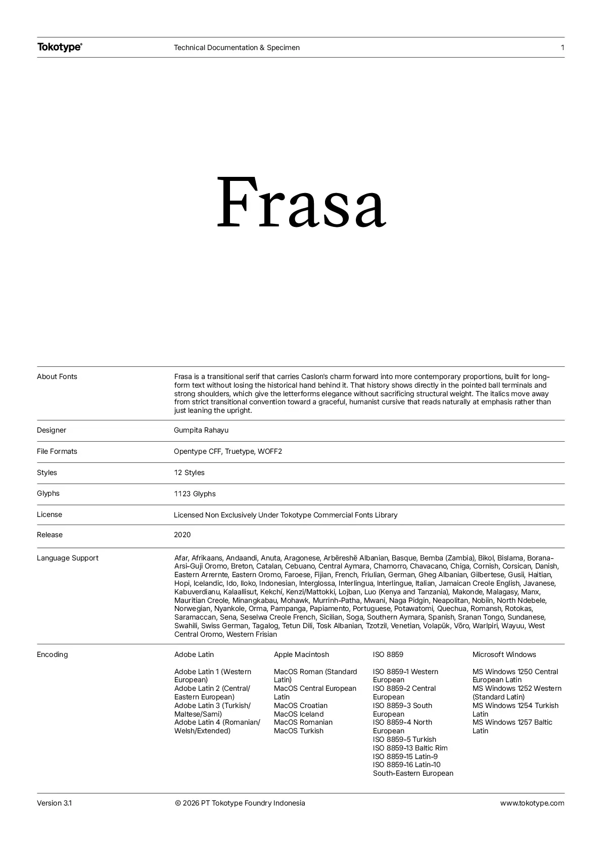
Frasa is a contemporary serif family that blends the charm of Caslon with subtle transitional influences. Designed for versatility, it balances refined proportions for long-form text. Its character is shaped by historical traditions, evident in details like pointed ball terminals and strong shoulders, which add both elegance and strength. The italics introduce a graceful, humanist touch, inspired by natural cursive forms that enhance emphasis and readability. With features like small caps, old-style figures, and ligatures, Frasa meets the demands of classic typography while serving as a powerful tool for both editorial and expressive design.

Font Information

Collections

12 Styles – Variable

Version

3.2

File Format

OTF, TTF, WOFF2

Designers

Gumpita Rahayu

PDF Specimen

PDF Specimen

Language Supports

Afar
Arvanitika Albanian
Eastern Arrernte
Afrikaans
Aragonese
Asturian
Anuta
Southern Aymara
Central Aymara
North Azerbaijani
Bemba (Zambia)
Bikol
Bislama
Bosnian
Breton
Catalan
Chavacano
Cebuano
Chiga
Chamorro
Chickasaw
Montenegrin
Cornish
Corsican
Seselwa Creole French
Danish
German
Lower Sorbian
Jola-Fonyi
Basque
Faroese
Fijian
French
Western Frisian
Friulian
Borana-Arsi-Guji Oromo
West Central Oromo
Gilbertese
Manx
Swiss German
Wayuu
Gusii
Gwichʼin
Eastern Oromo
Haitian
Hopi
Upper Sorbian
Hungarian
Igbo
Iloko
Indonesian
Icelandic
Italian
Jamaican Creole English
Javanese
Kalaallisut
Makonde
Kabuverdianu
Kekchí
Kaingang
Kirmanjki
Latgalian
Ganda
Luo (Kenya and Tanzania)
Mauritian Creole
Malagasy
Maltese
Mohawk
Maori
Creek
Murrinh-Patha
Kala Lagaw Ya
Naga Pidgin
Neapolitan
North Ndebele
Central Nahuatl
Norwegian
Nyankole
Orma
Pampanga
Papiamento
Portuguese
Potawatomi
Quechua
Cook Islands Māori
Romansh
Rotokas
Sicilian
Sena
Northern Sami
Samoan
Southern Sotho
Spanish
Saramaccan
Sranan Tongo
Serbian
Sundanese
Swahili
Atayal
Tetun Dili
Teso
Tagalog
Tokelau
Tsakhur
Talysh
Tonga (Tonga Islands)
Tzotzil
Uighur
Venetian
Vietnamese
Võro
Walser
Warlpiri
Mwani
Soga
Minang
Yoruba
Zapotec

Related Family

Frasa Display

Learn More

12 Styles – Variable

Download Trial Fonts for Free

Take our fonts for a spin! Enter your name, email address, and the font of your choice. Then, you can download it directly and start testing it for your project.